Project Overview
Yolanda Lopez, a sustainability-first furniture designer, needed a responsive website for her new company. She wants to showcase the four chairs that she has designed and make them available for pre-order.
Goals & Problems
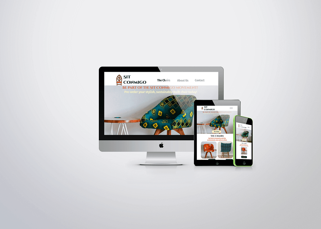
Yolanda wants to include a lot of information on her homepage: a large call-to-action image and text, a pre-order section with all four of her chairs, an about section with information about the company and her mission, and a full contact section. She has asked for mobile, tablet, and desktop design comps, as well as color and type styles based on the Sit Conmigo logo. Once the comps are completed, Yolanda will need exported assets to give to her web developer.

Design Process
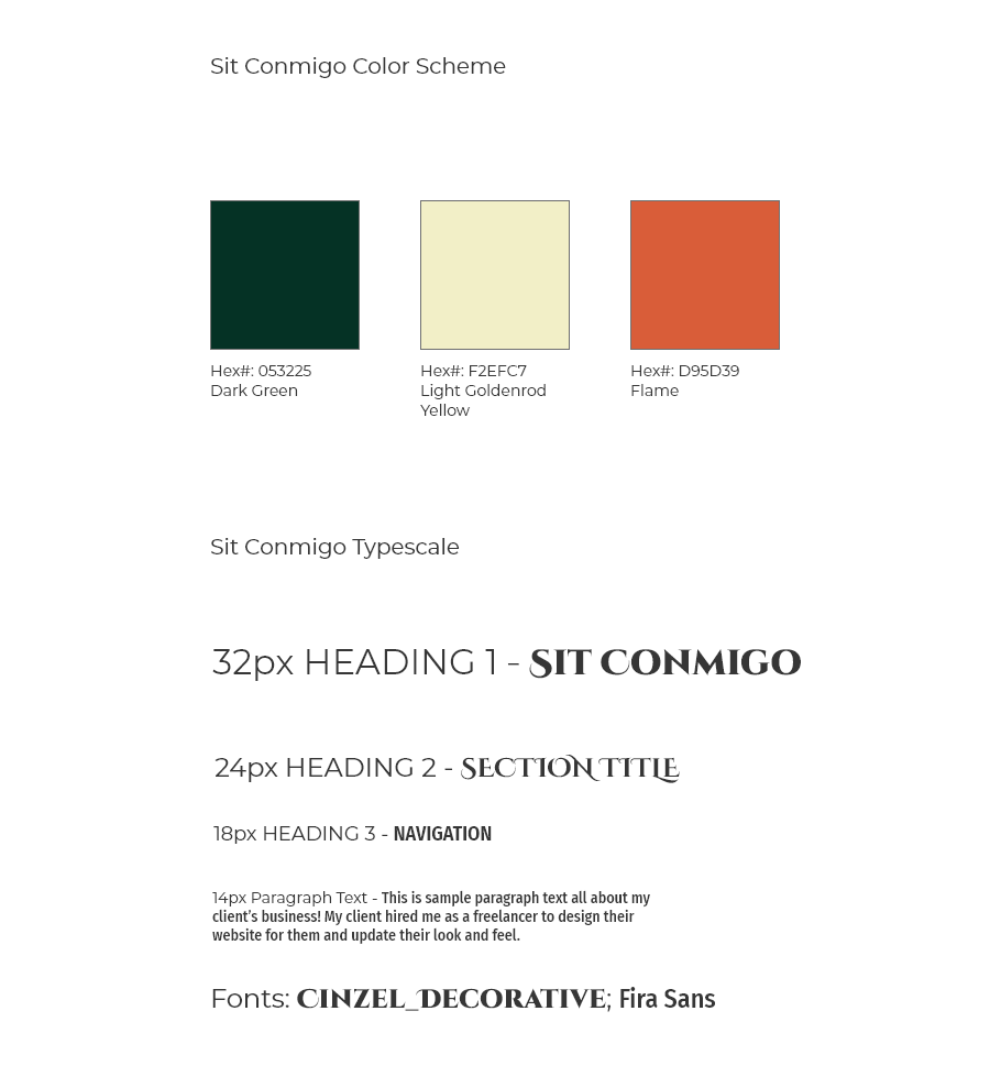
For this project, I leaned into the pictures the chairs that Yolanda provided. She used rich jewel tones and I wanted colors that would compliment them. I also used her logo as inspiration for my font choices. The logo is round and regal and needed a display font that would hold up to it. I went with Cinzel Decorative as the main font with Fira Sans as the secondary option.
Dark Green, Flame, and Light Condensed Yellow are the three colors I chose. While I used Flame as the logo color, I thought of Dark Green as the main color for the brand. Flame and Light Condensed Yellow are used as accents for contrast with the text and radial buttons set in place to pre-order the chairs.

The biggest challenge in this project was staying consistent across all three comps, making sure each element fit and conveyed the sustainability message that was so important to Yolanda.
Conclusions & Takeaways
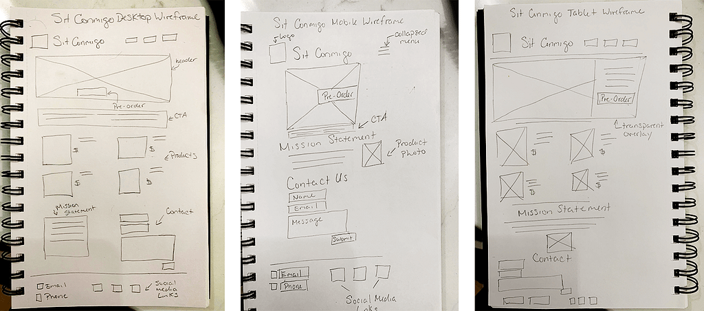
This project was all about the details. From spacing to consistency, I had to keep track of all three comps at the same time. Sizing and spacing were also important aspects of this project. I have to size the pictures correctly to allow for the appropriate spacing for the text Yolanda provided. I started with the mobile design comp first. It was the hardest to complete as it offered the least amount of space to work with. Once I was able to shrink everything down for the mobile site, I had a better idea of how the sizing and spacing should work for the tablet and desktop comps.
With all three comps, I had to keep Yolanda’s potential customers in mind, making sure that the site would be easy to use. The look and feel of the website had to keep consistent with Yolanda’s desire to invoke excitement, but also send the message that Sit Conmigo is serious and trustworthy because, ultimately, that is her message.
